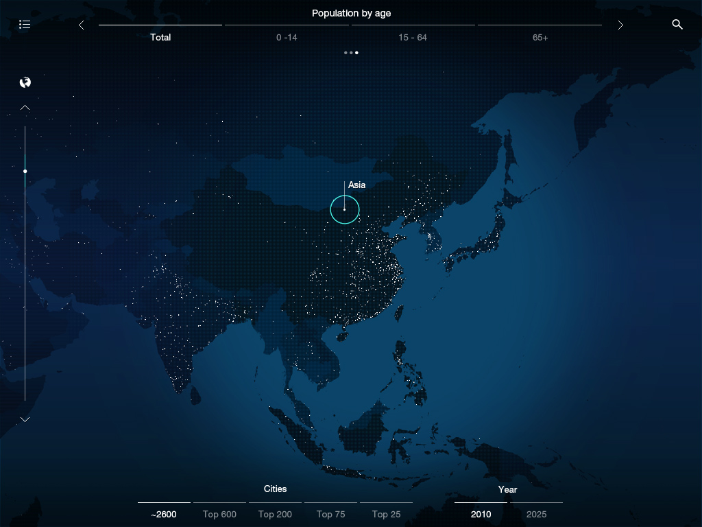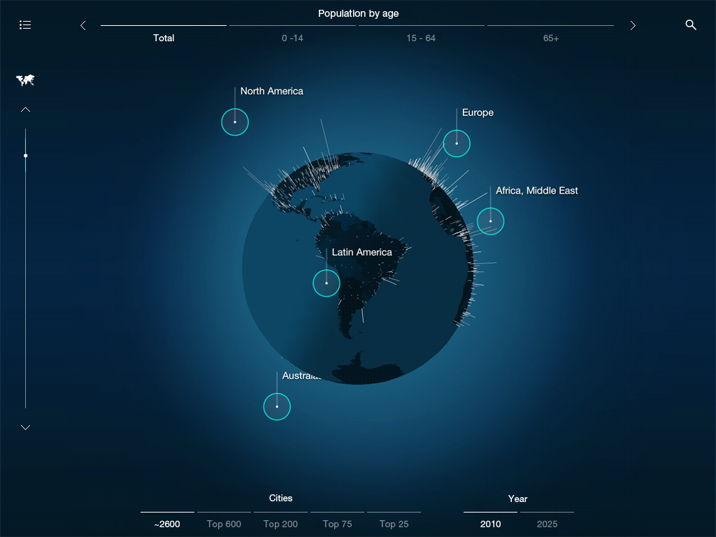
Our global management consulting client has an incredible set of data describing how the world has changed in the past, and how it is estimated to change in the future. They asked us to visualise this data on the iPad in a way that would be engaging and informative for all - from school children to company directors, everyone can learn a little from the app.
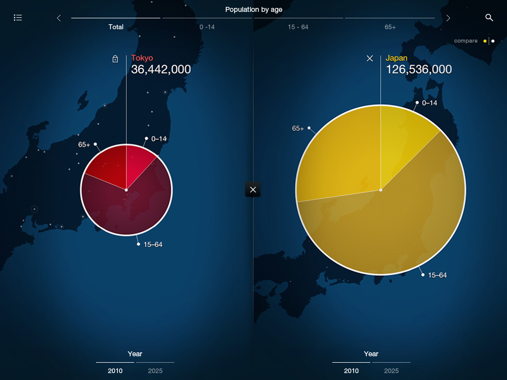
With around 50,000 data points for over 2,500 global cities, we presented this wealth of information on both a spinning globe and flat map. From here you can zoom in to a location, open a graphic representation of the data and compare it to any other region, country or city that you choose.